Brand Restructuring Case Study: From Traditional Ice Cream Shop to New Generation Brand – Ringo Ice Cream Parlor
- May 2
- 9 min read
This article will share a "Hsinchu Ice Cream Shop Brand Rebranding Case Study," analyzing the brand transformation of Ringo Ice Cream Parlor. BBLight Studio rebuilt the brand image and maintained an emotional connection with consumers through brand marketing strategy, brand positioning, and visual identity design. From brand strategy to complete logo design, it will guide you through the process of brand rebranding by integrating brand marketing and design.
The core consideration of brand rebranding: Why does a brand need to be updated?

In fact, brands, like people, grow and change over time. Whether it's a newly born brand, a brand in its rapid growth phase, or a long-established brand with a rich history, we always need to constantly reflect on what the core value of a brand's "existence" is. Brand rebranding isn't actually that complicated. It's about knowing yourself, finding a clear positioning, and ensuring that the brand is seen and remembered in a constantly changing era, expressing "who I am" in its own way.
From a brand marketing perspective, brand rebranding is not just about internal adjustments, but also about establishing a new external communication strategy. Through subsequent efforts in brand image and market positioning, the brand can continue to be recognized and chosen in market competition.
Brand Positioning: Ice Cream Shop Brand Design Inspired by Childhood Memories
What's the most unforgettable memory of your childhood? Is it the soft blanket by your pillow, the lullabies whispered before bed, or the toy cars you could never put down? "Childhood Memories," the core of Ringo Ice Cream's brand positioning, transcends the conceptual form of this brand rebranding process, becoming a rekindled emotional memory. Pre-determining the brand positioning not only significantly impacts subsequent visual identity design but also lays a crucial foundation for brand image building and marketing communication, becoming a highlight of the Ringo Ice Cream brand.
So a group of people followed the warmth of their memories to Dongmen Market in Hsinchu, determined to rediscover the beauty of their childhood.
"Ding-a-ling—" A group of children, just released from school, rushed into the shop, chattering like they were at a market. An auntie, legs crossed, casually glanced at the vulgar gossip on the counter. As the young customers gradually arrived, she finally strolled over to the ice cabinet, took out a huge, square block of ice, and stuffed it into the shaved ice machine. Swish, swish, swish—the crisp sound of the shaved ice turntable filled the large bowl in a few seconds, adding tapioca pearls, taro balls, peanuts, konjac, fresh dragon fruit, cantaloupe, and mango, then drizzling a large spoonful of brown sugar syrup and a generous amount of condensed milk. The crystal-clear toppings swirl in the bowl, exuding a slight coolness. This summer dessert, costing just a few coins, can bring smiles to children's faces.
In my memory, gathering at the ice cream shop was the most popular activity at the time. All sorts of gossip and fun things would happen here, and it was also a popular spot for dates. Even if you were suffering from heatstroke from the sun outside, as long as you came here, the sweltering heat would be left behind.
Brand Rebranding Strategy: From Local Ice Cream Shop to Complete Brand Image
Logo creation: Brand redesign is not about overthrowing, but about continuing.
Ringo Ice Cream Parlor is a local ice cream shop that originated in Hsinchu. It specializes in fresh fruit ice cream and unique Taiwanese flavors. The "U"-shaped corridor, retro ice-making machines, and consistent fruit ice cream flavors allow everyone who steps into the store to enjoy carefree and pure happiness.
Before starting the brand revamp, we spent a lot of time talking with the owner: "Why do we want to update? And what customer groups do we hope to reach?" Ringo Ice Cream Parlor is not just an ice cream shop, but a place that carries memories. For the gradually declining traditional ice cream shop, the new brand image does not forget its roots while being trendy, and continues the beautiful meaning of tradition.
We conducted a comprehensive review from a brand positioning perspective: discussing the brand's core values, emotional connection with consumers, and core brand philosophy one by one, and finally finalized the overall brand visual system.
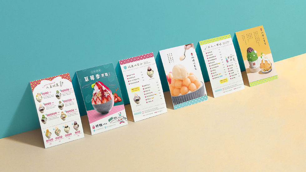
The planned production includes auxiliary graphics and a standard logo font, which can be widely used in stationery systems, business cards, print materials, and applied to business models and brand marketing to convey a complete brand concept and visual identity. This embodies the spirit that "brand rebranding is not about overthrowing, but about continuing." From a brand marketing strategy perspective, this continuity design helps reduce existing consumer perception gaps (brand recognition) while strengthening brand image consistency and memorability through optimized brand visual identity design.
Visual Identity Design: Creating a Consistent Brand Experience
Visual identity is the most direct element of brand image and a key factor in influencing consumers' first impressions in brand marketing. This systematic visual identity design has enabled Ringo Ice Cream to establish a more distinctive and consistent brand image in the market. BBLightStudio, through this brand marketing and image reshaping, has also restructured Ringo Ice Cream's marketing strategy, helping the company replace simple visual stimulation with "emotional connection," persuading through storytelling and connecting through emotion. The goal is for everyone who enters the store to be immersed in a "playful, colorful, and dreamlike" atmosphere, truly experiencing the warmth conveyed by the brand.
Brand Image Design: An Ice Cream Shop that Combines Retro, Trendy, and Vibrant Elements
As the consumer market evolves and evolves, catering to both new and old generations of customers is an inevitable challenge for brands. This brand rebranding focuses on injecting new life into the brand and building a bridge of communication with consumers. Through redesigning the brand image and integrating brand marketing strategies, the goal is to connect with the new generation of consumers on both visual and emotional levels. At the execution level, this rebranding primarily involves a comprehensive integration of three visual identity systems: logo design, color scheme, and auxiliary graphics.

The BBLight Studio team spent a considerable amount of time conducting field research to understand the origins of Ringo Ice Cream Parlor. Rebranding traditional industries often involves many limitations and concerns. By fully understanding the industry's current state and developing a comprehensive marketing plan, the ideas from both the industry and design teams were gradually realized. Ringo Ice Cream Parlor's brand philosophy is actually very simple—when you step into the store, it's like returning to the innocent days of childhood!
〈Ringo Ice and Fruit Room〉
Here's a simple way for you to enjoy ice cream.
Like a dream, like a bubble, like childhood, like a dream.
Transparent, beautiful, and slightly hazy
But the ice melted very quickly.
The ice melted as soon as it touched the tip of my tongue.
So we kept eating ice.
Want to hold onto the beauty that has passed
Cute and playful fresh fruit ice
Crystal clear and full of ingredients
Giving you the most memorable dream experience
—Written at Dongmen Market on November 10, 1997
To align with Ringo Ice Cream Parlor's core spirit—playfulness, freshness, vitality, and nostalgia—we employed a simple and delicate Japanese style to develop the overall visual identity, showcasing a rustic, rounded, and adorable brand image. The following three visual identity design principles are the core strategies for strengthening the brand image and brand marketing applications in this rebranding:
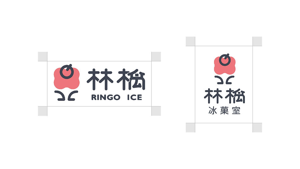
1. Japanese minimalist style logo
Ringo is actually the Japanese word for apple, and it was a trendy way of naming ice cream shops that was once popular in Taiwan. The shop features fresh fruit ice cream, and we can associate it with elements such as apple, shaved ice, melting, and taking a bite, so that people can clearly associate the ice cream shop with the image as soon as they see the logo.
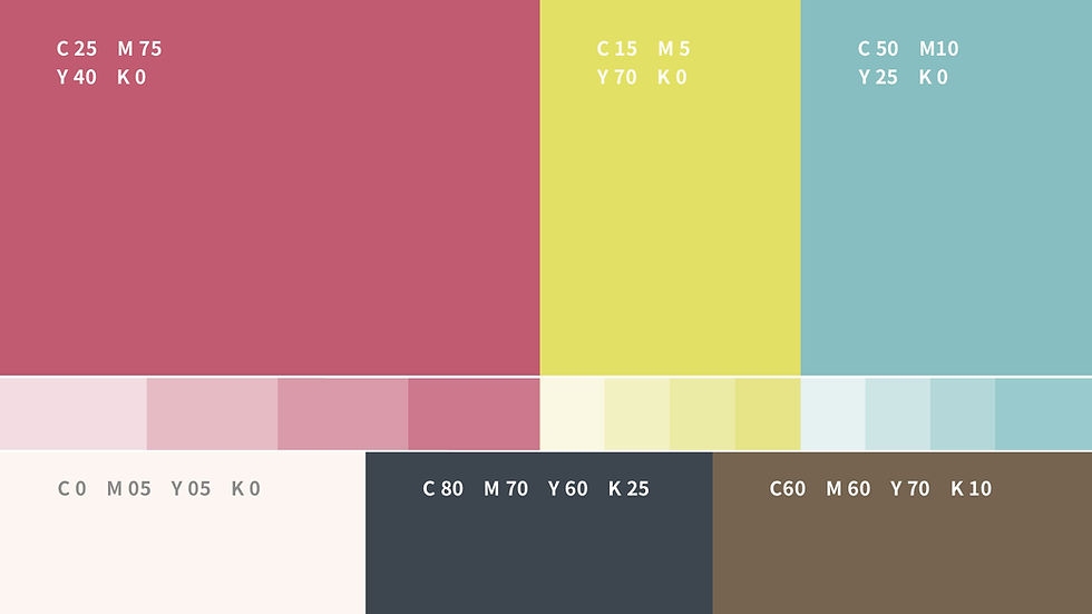
2. Light and airy summer color scheme
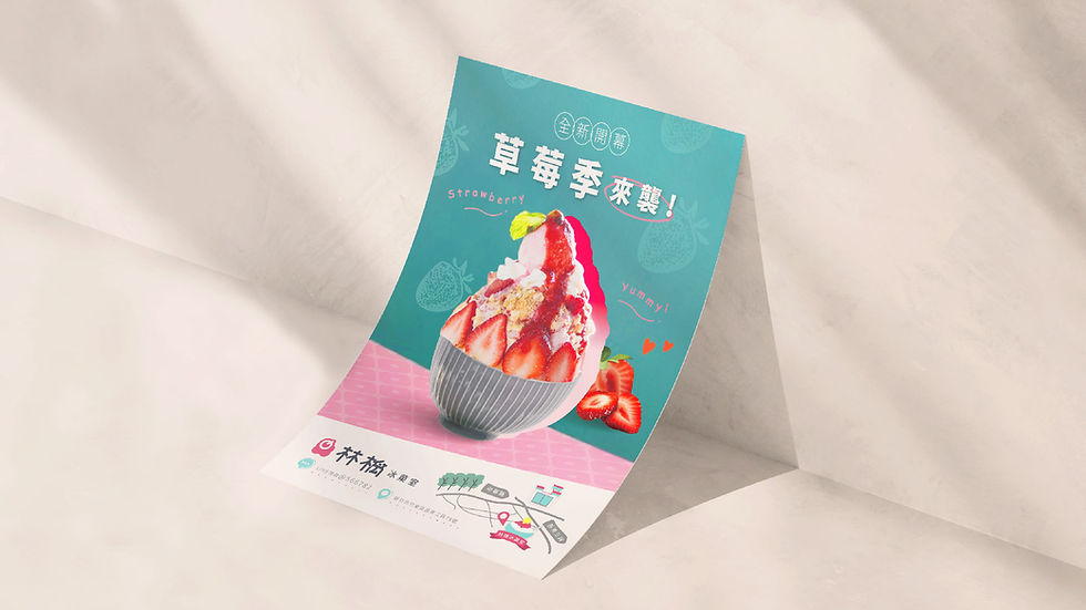
The original three primary colors, red, yellow, and blue, can greatly stimulate the five senses. In order to give people a light and refreshing summer color scheme, the color scheme was changed to low saturation and mixed with other colors. This makes the overall color scheme less bright, while still maintaining the impression of summer. The brand's color scheme uses peach, light blue, and clear yellow as the main colors, hoping to give people a lively and friendly impression.
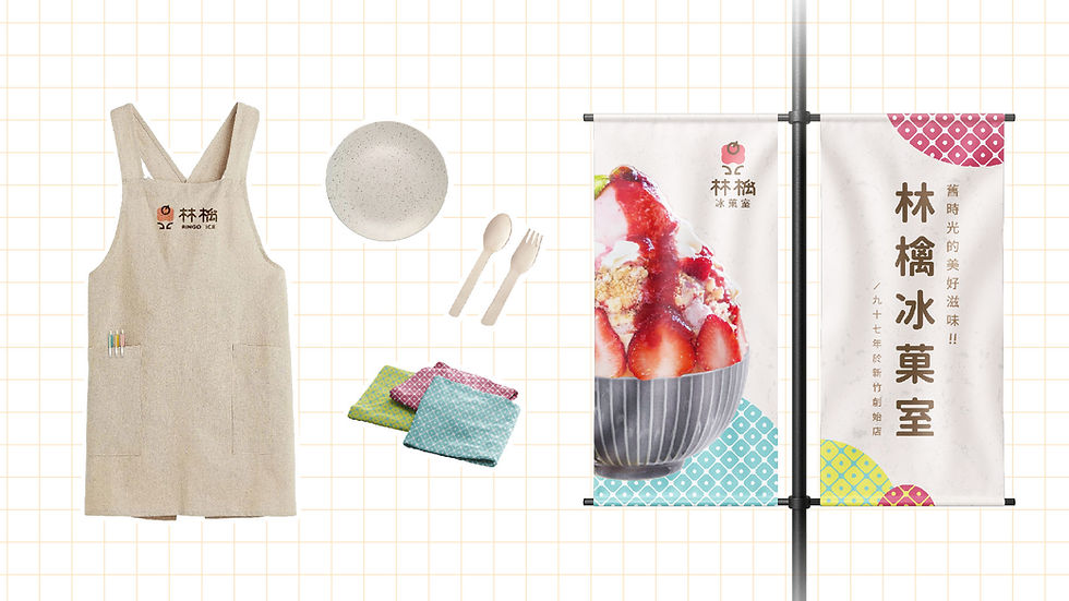
3. Hand-drawn auxiliary graphics
Often, a single logo alone is difficult to apply to all occasions and can easily become visually tiring. This is where auxiliary graphics under the brand design guidelines come in, providing a refreshing visual experience. They are highly practical for various usage scenarios, including but not limited to main visual events, store decoration, and product categories. When brainstorming elements, we used various traditional Taiwanese elements found in Taiwanese ice cream shops, presenting them in hand-drawn illustrations: window decorations, marble soda, summer fruits, round spoons—all showcasing the unique blend of modern and traditional aesthetics at Ringo Ice Cream Parlor .

Brand extension design: Brand marketing from visual identity to physical applications
Once the brand rebranding is complete and a comprehensive visual identity system is established, the key step in brand marketing is extending the brand image into reality (social media platforms, stationery systems, physical applications, etc.). Only by maintaining a consistent visual language across different contexts can the overall brand image be effectively strengthened, ensuring that Ringo Ice Cream maintains clear and distinctive visual recognition in every exposure.
This extended design, including the Kanto flag, store signage, and spatial wayfinding design, makes the brand highly recognizable in the neighborhood, attracting consumers' attention immediately. The uniform aprons and peripheral accessories design integrates the brand's characteristics into daily use, reflecting the brand's attention to detail. The design of business cards, promotional materials, and various printed materials also allows the brand to maintain good communication goals and convey a consistent brand feel in different communication scenarios.
Through these brand design extensions, Ringo Ice Cream Parlor has not only established a complete and functional visual identity system, but also truly integrated brand marketing into daily life, thereby deepening consumers' memory and emotional connection with the brand.


Conclusion | Brand rebranding is about building a deeper connection with consumers.
Brand rebranding is not just about updating the visuals; it's also about integrating brand strategy and market communication. At the marketing level, brand rebranding is a way to re-engage with the market, effectively enhancing overall brand awareness and market competitiveness. Through the two-way integration of brand image and visual identity, it allows the brand to maintain its influence in the market.
If asked when a brand rebranding might be needed, there are several possible scenarios:
Responding to a rapidly changing market (changing domestic and international market landscape)
Brand development status (newly established, stable phase)
Changes in values (mergers and acquisitions, change of CEO)
Notable examples include Starbucks, Apple, Black Cat Delivery Service, and Xiaomi, all of which have undergone brand renewal phases. In the course of business development, how to maintain the original visual characteristics while remaining flexible and innovative to adapt to market changes is crucial. At first glance, it may seem like only the logo has changed, but with a shift in corporate philosophy, the entire brand, including its employees, can undergo a complete transformation.
Through this brand revamp, Ringo Ice Cream Parlor has brought the traditional industry back into the spotlight, communicating with consumers through a fresh visual language and evoking the happiness associated with "eating ice cream." BBLight Studio believes that every redefinition of visual identity is an opportunity to engage in dialogue with the times. We firmly believe that the value of design lies in "listening, decoding, and translating." Only by deeply understanding and experiencing the brand's original intention can we find its strengths and make it shine in the market.

FAQ|Frequently Asked Questions about Brand Restructuring
Q: What is brand rebranding?
Brand repositioning refers to rebuilding a brand image and marketing communication methods through brand positioning, brand design, and visual identity updates. In addition to logo design, it also includes a complete visual identity system, such as brand colors, font specifications, auxiliary graphics, and brand extension designs applied to various media.
Q: Does a brand rebranding necessarily require changing the logo?
Not necessarily. The key lies in brand strategy and overall identity system, rather than changes to a single element design.
Q: What is the relationship between rebranding and brand marketing?
Brand repositioning is an important part of brand marketing strategy. By re-evaluating brand positioning and image, subsequent marketing communication becomes more consistent and recognizable, thereby enhancing the brand's competitiveness in the market.
Q: What kind of industries are suitable for brand rebranding?
Whether it's a traditional industry, a catering brand, or a startup brand, any brand facing market transformation, customer base changes, or brand aging is suitable for brand rebranding.
Q: After the brand design is completed, how can the brand marketing effect be sustained?
By consistently implementing brand marketing strategies, such as social media content, spatial visuals, packaging design, and event visuals, the brand image can remain consistent across different touchpoints, thus accumulating brand value in the long run.
If you are considering brand positioning, brand design, or have logo design needs, feel free to contact BBLight Studio. We will assist you from strategy to visuals in building a consistent and long-lasting brand image.
#Visual Design#Graphic Design Studio
Comments